Recently in Photography

  Page 219 of 385 in Photography  

Giants pitcher Ryan Vogelsong had his stuff working, and hitters Melky Cabrera and Buster Posey did their jobs at the plate. The result: Giants defeat Clayton Kershaw and the Dodgers 2-0 to pull within one game of the lead in the National League West.

I was there in lower section 128, row 13 on the third base side with my Olympus OM-D E-M5 and Olympus 40-150mm zoom.

Buster Posey Hits Buster Posey connects against the Dodgers at AT&T Park. Photo by Derrick Story. You can see the entire set of images on the TDS Flickr page.

I parked the ISO at 1600 and used Aperture Priority to keep the zoom at the widest setting (f/4-f/5.6). When extended to 150mm on the OM-D, the effective power of the lens was 300mm because you double the focal length for micro four thirds. The high speed burst mode (9 fps) was a pleasure for capturing the action. And since the entire package was so compact, I was able to enjoy the game as a fan and grab a few photos when the action heated up.

Ball for Young Fan Ball for young fan. Photo by Derrick Story

Special Thanks to Hunt's Photo

As you may have read in earlier posts, I had two temporary review copies of the Olympus OM-D, but was having problems purchasing one for myself. I had orders placed with the typical big camera suppliers, and they kept getting delayed.

So I contacted the great people at Hunt's Photo & Video based in New England, US. I worked with Gary, who contacted Olympus US to see what he could do. Within a week my Olympus OM-D was on its way to me. The price was the same as what the other camera suppliers were charging, but the service was heads above. And yes, Hunt's offers free shipping too.

They have a wonderful newsletter that comes out every couple weeks with lots of specials. I use it to help keep up on the latest releases. You might want to try it yourself.

Thanks to Gary and the entire Hunt's crew for getting that Olympus OM-D in my hands so I could shoot this great baseball game at AT&T Park.


You can find more photo tips and "photography how tos" on my Pinterest page.


Whether you work with models regularly, or are contemplating your first shoot, this week's podcast includes "5 Don'ts" for these projects. These warnings were culled from many conversations with the models I work with for TDS workshops and other projects.

In the second story I talk about the winner from the recent World's Ugliest Dog competition. Why? Because an artistic handling of an "ugly" subject can lead to an impressive photograph.

And finally, SizzlPix is offering a 20 percent discount to TDS listeners... on any size or quantity. Listen in to learn how you can take advantage and get "sizzled" for less.

Listen to the Podcast

You can also download the podcast here (30 minutes). Or better yet, subscribe to the podcast in iTunes. You can support this podcast by purchasing the TDS iPhone App for only $2.99 from the Apple App Store.

Monthly Photo Assignment

Signs is the June 2012 Photo Assignment. You can read more about how to submit on our Member Participation page. Deadline for entry is June 30, 2012.

More Ways to Participate

Want to share photos and talk with other members in our virtual camera club? Check out our Flickr Public Group. And from those images, I choose the TDS Member Photo of the Day.

Podcast Sponsors

Red River Paper -- The $7.99 Sample Kit is back! And with free shipping.

Make Your Photos Sizzle with Color! -- SizzlPix is like High Definition TV for your photography.

Need a New Photo Bag? Check out the Lowepro Specialty Store on The Digital Story and use discount code LP20 to saven 20% at check out.


Technorati Tags:
, , , , ,


One of the many feature improvements in Aperture 3.3 is the White Balance tool. Among its enhancements is an "uber auto" button and three "filters" for different types of photos. Here's an overview to get you up and running right away.

renee_white_balance.jpg The new white balance tool in Aperture 3.3 includes a "skin tone" option for your portraits. Photo by Derrick Story. Click on image for larger size.

White Balance Popup Menu

Prior to Aperture 3.3 your white balance option was Temperature and Tint. Now there are two additional choices: Skin Tone and Natural Gray. Plus, there's an Auto button, but I'll get to that a bit later.

  • Skin Tone - a great choice for portraits. This new algorithm is designed for portraits. Simply place the eye dropper on a skin tone and click.
  • Natural Gray - designed to correct color cast, but to also leave some feel for the ambient color in your image. In other words, it won't over-correct your photo. An example could be an underwater scene where you want to temper the blue, but not eliminate it all together.
  • Temperature and Tint - this choice is best for color casts that are more extreme where you really need to get in there and move sliders around.

Auto Button

The White Balance brick also includes an Auto button. When you click on it, Aperture runs all three "filters" and you can choose your favorite version. Auto Skin Tone works best when Faces is enabled because Aperture will use face detection technology to fine tune the correction. I had good luck with it, however, even when Faces was not enabled.

What's fun about Auto is that once you run it, you can cycle through the 3 filters to see the different types of corrections, then choose the one you want to use. On this portrait, for example, the Skin Tone version is beautiful, but the Natural Gray and Temperature and Tint versions were a bit too cool.

Recommended Workflow

Apple has made white balance so easy. I recommend that you begin by clicking the Auto button. Then cycle through the 3 filters and choose the look you like best. You can then fine tune the color by using the slider for that filter.

Keep in mind that these corrections are brushable too. So you can further adjust the color in specific areas. I'll cover that in a future post.

Aperture Tips and Techniques

To learn more about Aperture 3, check out my Aperture 3 Essential Training on Lynda.com. Also, take a look at our Aperture 3 Learning Center. Tons of free content about how to get the most out of Aperture.

My next open Aperture Workshop is scheduled for Nov. 2012, in Santa Rosa, CA. You can get on the pre-registration list, plus learn about all the other photography workshops offered this season by visiting the TDS Workshops page.


The Digital Story on Facebook -- discussion, outstanding images from the TDS community, and inside information. Join our celebration of great photography!
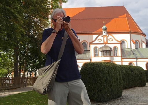
Creating silhouette images is one of the easiest in photography, and often produces interesting pictures. The trick is to control the placement of the negative space in the composition, and to make sure your flash is turned off.

aquarium_silhouette.jpg "Aquarium Silhouette" Click on photo for larger size. Image by Derrick Story.

For example, in this aquarium shot, I had to wait a while until I had two people positioned on the left side. The process went something like this: 1) saw the potential for a good shot, 2) grabbed a position that had the right composition, 3) checked my camera settings, and 4) waited...

Once the elements come together, the actual picture taking is simple. The camera will read the large bright area and usually ignore the silhouetted subjects. So your photograph should be good to go without too much post production fooling around. Just make sure you're not in "auto everything" mode and that your flash is turned off. I think regular "program" mode works great for these types of compositions.

I like the graphical nature of silhouettes. And when these types of images are mixed in with your "regular" photos, they'll certainly grab the attention of the viewer's eye.


You can find more photo tips and "photography how tos" on my Pinterest page.


For the last few years, a chorus of us have been chanting that "the best camera is the one that you have with you." And I totally agree with that. But with high-end point & shoots improving in quality, and Compact System Cameras finding their stride, the "best camera with you" doesn't always have to be your mobile phone.

courting_butterflies.jpg "Courting Butterflies" captured with an Olympus E-PL2 with stock 14-42mm zoom during a family outing. Photo by Derrick Story. Click on image for larger version.

Don't get me wrong. I love shooting with my iPhone 4S. And there have been countless occasions where it has produced wonderful images I would not have otherwise captured. But whenever possible, I also tote a micro four thirds camera, such as an Olympus PEN, even on the most casual of family outings. Why?

  • Greater choice in lenses. I can use a compact zoom or a prime lens, depending on my mood.
  • Raw files. Don't need to say more here.
  • Better shutter speed and aperture control.
  • Bigger files, in case I want to make bigger prints.
  • More options, such as flash control, metering patterns, etc.

I enjoy those moments where I can wander off for a short bit and take a few pictures. In those instances, I love having a more advanced camera... while still knowing the iPhone is in my pocket if I need it.


You can find more photo tips and "photography how tos" on my Pinterest page.


I upgraded to the new MacBook Pro with Retina display for my everyday work. Chief among the reasons why was the 15" Retina display and the NIVIDA graphics card.

Just for fun, I loaded the same Raw file in Aperture 3.3 on both the new MacBook Pro and my 2010 MacBook Air (which I like a lot). The results were interesting.

retina_display_comparison.jpg MacBook Pro Retina Display on the left, 2010 MacBook Air on the right. Click on image for larger version. Photo by Derrick Story.

Specs aside, the first thing that jumped out at me is that the Retina display is more "photographic" than the image on the MacBook Air. I know many people are thinking detail with this display, but what I noticed is a more subtle gradation of tones. That's what I mean by more photographic. The image on the Retina display has some of the characteristics of a film based print. Look at the hair and the left side of the face.

The next attribute that impressed me was color. There is more of it in the Retina display. Keep in mind that it's just not the LCD we're talking about here. There is an entire set of technologies under the hood, that rolled up, contribute to the final image.

Both displays were set to the "Color LCD" profile with exactly the same file shown full screen mode in Aperture 3.3. The color was more accurate on the Retina display. No calibration on either machine. This is "out of the box" stuff.

As you might expect, there's a bump in detail too. But it's not an "earth shattering going to change the world" improvement. And I think part of the detail improvement is the better handling of tones so you can actually see the detail... if you know what I mean.

None of this is intended to be scientific. I'm a photographer walking by two computers with the same image on their screens. It's like the HD television wall at Best Buy. Even the comparison image here is a snapshot captured with an Olympus E-PL2 that was in my backpack at the time.

But, if you just go by what you see on the screen, then I have to say that what I like about the Retina display is that I feel like I'm looking at a photograph, not a computer screen.

Is that worth the $2,199 I paid for the 15" MacBook Pro? Well, considering how many pictures I look at on a weekly basis... the answer is yes.

Aperture Tips and Techniques

To learn more about Aperture 3, check out my Aperture 3 Essential Training on Lynda.com. Also, take a look at our Aperture 3 Learning Center. Tons of free content about how to get the most out of Aperture.

My next open Aperture Workshop is scheduled for Nov. 2012, in Santa Rosa, CA. You can get on the pre-registration list, plus learn about all the other photography workshops offered this season by visiting the TDS Workshops page.


The Digital Story on Facebook -- discussion, outstanding images from the TDS community, and inside information. Join our celebration of great photography!

Imagine waking up on the beautiful Northern Californian coastline, and the only item on the day's agenda is to focus on your photography. You can experience that on Aug. 24-26 at the Sonoma Coast Photography Workshop.

bodega_bay_alyssa.jpg

Here's what your weekend would look like:

Fri., August 24
5:30 pm - Optional visit to our Field HQ at Doran Beach Park. Refreshments served.

Sat, August 25
8:30 am - Meet at the Bodega Bay Lodge Library
9:00 am - Classroom session on environmental portraiture
10:00 am -Model Shoot #1 at Lodge
11:30 am -Depart for Doran Beach
11:45 am -Lunch at Doran Regional Beach Park
12:30 pm - Model shoot #2 at beach
2:00 pm - Return to Bodega Lodge Library for lab work and classroom session
4:30 pm - Photo walk at beach
6:00 pm - Depart for dinner and relaxation

Sun, August 26
8:30 am - Depart for Ft. Ross State Historic Park
9:30 am - Field session on landscape photography
10:00 am - Landscape shoot at Ft. Ross
11:30 am - Lunch at Ft. Ross
12:00 pm - Depart for Goat Rock for Harbor Seal shoot
12:30 pm - Landscape and wildlife shoot at Goat Rock
2:00 pm - Depart for Bodega Bay Lodge
2:30 pm - Lab work at the Lodge Library
4:30 pm - Student presentation of best images from weekend
5:30 pm - Optional photo walk to Doran Beach Park

Your workshop fee of $550 includes facility fees at Bodega Bay Lodge conference room (with French Doors that open up to the coastal landscape), field station at Doran State Beach, park fees, lunches both days, modeling fees, and instruction. Every participant receives a Lowepro camera bag.

To join our group, simply go to the TDS Workshop page and complete the "Send Me Info" form. It takes 15 seconds... I'll then send you a registration form and follow up details.

I keep these groups very small so to maximize your enjoyment. I hope you can join us on the coast this summer.


You can find more photo tips and "photography how tos" on my Pinterest page.


My 5 Favorite iPad Apps

In the world of photography, the iPad has become an equal partner in my gear bag. Among the many reasons I like it so much are that the apps are affordable, easy to use, and targeted to specific functions. Just like everyone else, I have my favorites. And I'd like to know yours too.

ipad_apps_june_2012.jpg Are any of these on my list of 5 favorite iPad apps? You bet!

Since I am a photographer, I'm going to be biased toward imaging apps. But photography isn't always about just taking pictures. We have to do other stuff too. So my five favorites right now are:

  • iPhoto for iOS - Terrific all-around imaging app that interacts well with the Apple ecosystem.
  • iStopMotion for iPad - Recording and managing time lapse movies has never been easier or more fun.
  • PhotoSync - Even though I use iCloud and like it, sometimes I just want to "send this photo to this device" right now. PhotoSync does that easily and quickly.
  • iA Writer - For me, this is the best note-taking app on the planet. Clean, functional, easy to use. And it interacts with iCloud so my documents are up to date all the time on all iOS devices.
  • Reminders - I've tried many "ToDo" apps, but in the end, Reminders works the best for me because of its deep integration in iOS and iCloud.

So what are your current five favorites? Post them in the comments if you want to share.


You can find more photo tips and "photography how tos" on my Pinterest page.


Imagine a set-up that includes modifiers for three flashes, a grid spot, two sets of gels, and a diffusion panel, yet only occupies the same amount of space as a standard laptop computer. That's the Rogue Master Lighting Kit by ExpoImaging, and I discuss how it could be very handy for nimble portrait photographers.

Then I talk about my experience at the US Open Golf Championship last week, and share a few tips for photographing these types of events.

I wrap up with an update about the upcoming Sonoma Coast Photography Workshop, TWiP, and the new MacBook Pro. Lots of ground to cover. I hope you enjoy the show.

Listen to the Podcast

You can also download the podcast here (32 minutes). Or better yet, subscribe to the podcast in iTunes. You can support this podcast by purchasing the TDS iPhone App for only $2.99 from the Apple App Store.

Monthly Photo Assignment

Signs is the June 2012 Photo Assignment. You can read more about how to submit on our Member Participation page. Deadline for entry is June 30, 2012.

More Ways to Participate

Want to share photos and talk with other members in our virtual camera club? Check out our Flickr Public Group. And from those images, I choose the TDS Member Photo of the Day.

Podcast Sponsors

Red River Paper -- The $7.99 Sample Kit is back! And with free shipping.

Make Your Photos Sizzle with Color! -- SizzlPix is like High Definition TV for your photography.

Need a New Photo Bag? Check out the Lowepro Specialty Store on The Digital Story and use discount code LP20 to saven 20% at check out.


Technorati Tags:
, , , , ,


The Rogue Master Lighting Kitprovides the nimble photographer with a variety of flash modifiers and gels in kit that occupies about as much space as a full size laptop computer. I recently shot a portrait session using just two Canon Speedlites with FlashBenders attached.

Leah Seated Portrait of Leah Lavoneh captured with two FlashBenders, one with a diffusion panel. Photo by Derrick Story.

One of the interesting new features in the master kit is a diffusion panel for the large FlashBender. The clever design attaches to the front of the FlashBender via robust hook and loop material. The flash head positioned between the two pieces, like a sandwich. I used this for the main light, with the small reflector as the fill.

FlashBender Set Up Two-light set up for the above portrait using the large FlashBender with diffusion panel as the main light.

In addition to the three different sized FlashBenders and the grid modifier in the kit, Rogue also includes two sets of gels. These have both creative and corrective applications. I particularly liked the gel set for the grid that allowed me to throw a splash of color on a background or even used as an interesting hair light.

Leah Holding FlashBender Kit The Rogue Master Lighting Kit takes up little space, but provides you with a complete flash modification set-up.

I noticed that the FlashBenders themselves have improved fasteners and updated design. I had no problem securing them to any of my flashes, and I have quite a variety of strobes in the studio.

If you're looking for an affordable light modifier set-up to handle a variety of needs, especially when traveling light, consider the Rogue Master Lighting Kitthat sells for $199. There are plenty of goodies in there to spur your lighting creativity.


You can find more photo tips and "photography how tos" on my Pinterest page.